Ride PRT
Pittsburgh Regional Transit
New Name. New Direction.
Port Authority of Allegheny County’s brand wasn’t up to speed with the city of Pittsburgh’s growth, the region’s outlook, or a forward-thinking transit system. It was time for a new direction. Red House was tapped to drive a new brand strategy, name and look.
Pittsburgh Regional Transit promises to be simple to use and understand, easy to like, and a seamless part of everyday life. The new name is just the beginning.
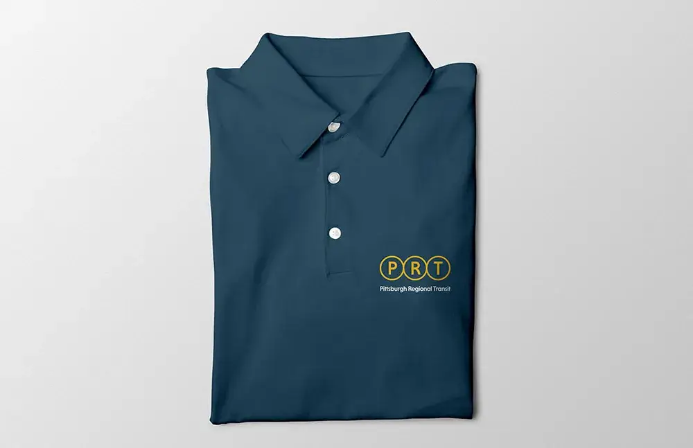
With a nod to transit map iconongraphy, the logo quickly communicates PRT's purpose. Vertical, horizontal and triangular options bring greater design flexibility.


The Cadet Blue and Gold reflect the Pittsburgh region’s rivers and bridges.

To launch the new brand, Red House designed bus and light rail wraps, bus shelters, posters, uniforms, social headers and posts, and collateral.

